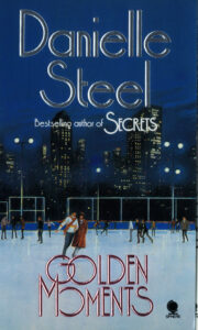
How to design a Book and other stories
Danielle Steel | 1985-6

 For relatively small publishers, like Sphere Books, there are always a few authors about whose axis the company’s survival often revolves. Prolific, high-profile, bestselling… Danielle Steel was just such an author for Sphere where she had full cover approval and maintained a very tight control on all design decisions.
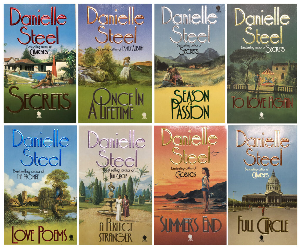
A long backlist of popular titles means that, over time, the covers begin to look tired and dated and a freshen-up to attract new readers is required. Danielle Steel’s style to date had been pastel colours, embellished with foiled floral motifs, but it was the 80s, striking fonts and colour was back.
Danielle was also one of the first authors to insist on a different author photograph for every book or re-cover project. Each time her head shot arrived as an expertly retouched transparency (all the work done on the film itself - remember this was five years before the first version of Photoshop). There were also strict instructions that the image had to be used in full frame with no alterations.
Meanwhile back in the design studio… Marketing feedback from the big booksellers meant the re-fresh needed full colour illustrations and look more like American romance novels. This meant all 13 titles (and counting) were to have new illustrations and a complete re-design. This was a big job for me and an even bigger job for the illustrator Chris Collingwood. Let’s face it, there are only so many ways you can re-interpret a couple walking hand-in hand in a glamorous setting and this really tested Chris’s ingenuity.
Once Chris had done the illustration I then had to design the covers and send them out, via DHL (the fax machine was an exciting invention still to come), to the US to get Danielle’s approval.

Each visual had to look like the final printed cover. To do this I got photos of the artwork done by one of our photographic services with the help of their rep Rod Wynne-Powell,. A quietly spoken man, Rod loved his job, and was an amazing repository of photography knowledge. When the print came back I had to hand-paint the text on to the back of acetate, I then hand cut the foil and stuck it on a clear acetate over the photograph, so it looked bright and shiny, just as the final cover would.
Around a week to 10 days later our beautifully crafted mock-up would arrive back with comments and amends from the Danielle, which we had to sort through and produce another visual for sign off… If Chris and I could have received the air miles clocked by our globe trotting artwork I doubt either of us would have paid for a flight for the next ten years.
Life is so much easier now when we can share a Skype or Zoom screen and work on a design in realtime, while talking to someone anywhere in the world. Taking on international projects today that couldn’t have been contemplated back then. All 13 titles took about 4 months to complete.
In a cruel twist of fate, when Sphere Books was taken over by Penguin, my boss and Art Director, Lizzie, made the move to Transworld coinciding with Danielle Steel choosing Transworld for her publishers. Guess what? One of Lizzie’s first jobs was to recover all Danielle’s titles again, as well as her new book, and only six months after we had completed the Sphere re-covers… plus ça change, plus c'est la même chose.
The books are still available here
