How to design a Book and other stories
First day at Sphere, and my first book cover

My first “proper”job.
 My first day at Sphere Books. I was living in Kennington in south-east London at the time and had already practised my commute via Chancery Lane Tube up to Gray’s Inn Road several times before arriving way too early on my first day. After an anxious wander around the traditional street market in Leather Lane, nine a.m. finally came and I walked in.
Lizzie showed me round and introduced me to the team I would be part of I would be a part of: commissioning editors, Barbara Boote and Ann Suster, both of which had laser-like eye for detail; head of sales, Dag Smith, who sounded like a hero from one of our more epic adventure books and production manager Jeremy Kuo. Jeremy’s job involved collecting the artworks, getting the proofs and then once approved, the print runs. Obsessed with Sumo Wrestling, and already impressively large and always cheery, Jeremy wanted to get to 200 lbs so he could compete.
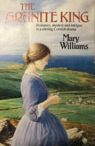
Once kitted out by the local art store, by mid-morning I was ready and Lizzie briefed me on my very first book cover for ‘The Granite King’. She handed me the illustration artwork, showed me where the type catalogues were and, accompanied by the vocal talents of Marvin Gaye I was off. We were the only department at Sphere Books where music was permitted… This already felt like home.
At college I had asked about designing and specifying full colour work and was reassuringly told “Oh you won’t need to do that for years”. Just four months later, here I was a junior designer at a London publisher where everything, EVERYTHING was four colour…
Back in 1984 we designed covers by sizing and tracing the image from the original artwork, and type from type sample books on an ancient Grant enlarger. Once we had two to three versions, we showed them to Lizzie. If she was happy she chose one and then we moved on to the photography. Cover designs at college were two-week projects; real life: two days, including camera ready artwork.
Once the design was complete and approved we set about specifying the typesetting and developing the colour. The typesetting was done by two different agencies: Spectrum (text) and Panache (headline). Before digital desktop publishing the whole artwork process was very different. We had to specify the type from a manual, the marked up text was collected from the studio and by next morning the setting was waiting to be pasted up onto an artwork board. You knew instantly if you had done it right or wrong. Every redo was costly and not encouraged!
For me specifying type was straightforward because of the work I had done at Kall Kwik and the freelance artwork I had been doing, since arriving back in London from college in Exeter, had thankfully already sharpened up the basic knowledge I had when I graduated.
 Then the colour specifying, how hard could it be? I had specified spot colours (for those in the know that means Pantone colours) at college and had worked in the printing part of the typography department, so I knew what the specification was for and how printers, as opposed to designers, used them.
Back at Sphere I made it my business to carefully watch Richard Evans, a Bradford born designer with a strong liking of early Marvin Gaye (did I mention Marvin was omni-present during my early work?) who sat next to me. The colour specifying books showed loads of squares of colour. You could work out the specification by where the colour square was on the page. Turns out it wasn’t rocket science, it was a just like making a grid reference. That was a relief!
My first ever mark up C5%-M100%-y-100%-k-10%.
This book is still available here 36 years later.
