
by Ned Hoste | 18, 05 2023 | How to Design a Book and Other Stories
Back in the late 80s the Falcon Game Book Series was highly innovative; the reader was the hero, taking a story path of their own choosing. Today, this is laughably tame and laborious, compared with our easily accessible digital escapism, role playing on our smart phones across time zones and continents. But, remember, this was all before Alan Sugar introduced the Amstrad home computer, complete with its 3.5” floppy discs. Internet for all was in its infancy and Dungeons and Dragons (D&D) was THE ‘gaming’ experience.

by Ned Hoste | 17, 05 2023 | How to Design a Book and Other Stories
Although the impact of this particular story has faded over time, it was, on publication, a highly controversial and political title. Illuminating the “Westland affair” of 1985-86 the book exposed cabinet in-fighting and Thatcher’s autocratic style to public scrutiny. Following hot on the heels of the Miners’ strike and coming just before the “Poll Tax” controversy, this was, arguably, the first of the internal disagreements to reveal the widening fissures in the Conservative party over the UK’s position in Europe. Written by Magnus Linklater the Managing Editor, and David Leigh the Chief Investigative Reporter, at The Observer, the research behind the book came with the highest of investigative credentials.
by Ned Hoste | 17, 05 2023 | How to Design a Book and Other Stories
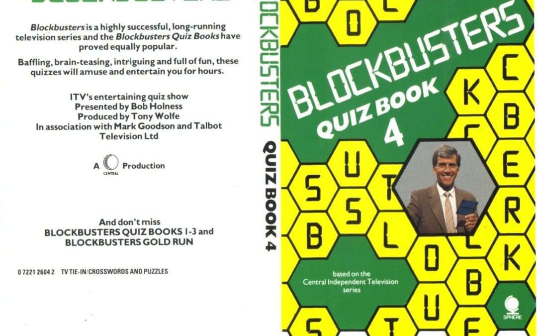
During the 1980s Blockbusters was a hugely popular TV quiz in the UK. An American import, the show’s enthusiastic contestants answered trivia questions based on an initial letter that they picked from a board. The idea being to complete a run of letters and create a word before the opposition. Say, “I’ll have a B please Bob” to anyone of a certain age and they’ll know instantly what you’re talking about.
by Ned Hoste | 16, 05 2023 | How to Design a Book and Other Stories
The first really high profile author series style I designed at Sphere Books was Clive Barker’s Books of Blood. Already published in paperback, Clive didn’t like the original designs and convinced his editor that only he could do the cover paintings, as they were his stories and he was best placed to make all the characters come to life. Fair point.

by Ned Hoste | 16, 05 2023 | How to Design a Book and Other Stories
Some authors are so popular, that they get their own series style. Alan Scholefield was one. With writing skills to master a range of genres, at Sphere Books we focussed on Alan’s ‘epic adventures’.
The lettering style for Alan’s epics was the first ‘author style’ I designed and drew up myself at Sphere, rather than commissioning one of the lettering artworkers we used. I was inspired by the Albertus font, however, because the name Scholefield is so long, I had to adjust the proportions and embolden the serifs, so it would work at a size that could be seen across a book store and attract his many readers.

by Ned Hoste | 16, 05 2023 | How to Design a Book and Other Stories
Clive Ponting was the civil servant who, along with Tam Dalyell MP, was instrumental in revealing Whitehall secrets behind the notorious Belgrano Affair and I was given the job of designing the cover of his exposé.
The General Belgrano was an Argentinian cruiser, sunk on 2nd May 1982, during the Falklands War. Clive’s book would reveal that, when struck by two torpedos from HMS Conqueror, a British hunter-killer Churchill class nuclear-powered submarine, the General Belgrano was, not only outside the combat zone, but also sailing away from it when hit. She sank with all hands, 323 lives were lost.

by Ned Hoste | 16, 05 2023 | How to Design a Book and Other Stories
There was something very cool about the Abacus imprint at Sphere; a unique, rare joy infused their tiny office space where Mike Petty, the editorial director, often penned his unnerving but highly diverting design feedback as song lyrics.

by Ned Hoste | 16, 05 2023 | How to Design a Book and Other Stories
My design degree, from Exeter College of Art and Design, was focussed on typography and lettering design, and, during my studies, I was lucky enough to be taught by some extraordinary and influential lettering designers and calligraphers.

by Ned Hoste | 16, 05 2023 | How to Design a Book and Other Stories
My first day at Sphere Books. I was living in Kennington in south-east London at the time and had already practised my commute via Chancery Lane Tube up to Gray’s Inn Road several times before arriving way too early on my first day. After an anxious wander around the traditional street market in Leather Lane, nine a.m. finally came and I walked in.

by Ned Hoste | 16, 05 2023 | How to Design a Book and Other Stories
In design every career there comes those break-through moments; for me there were three in as many months – 1984 was an amazing year!
In July of that year I received my degree in Graphic Design and Typography from Exeter College of Art and Design. Secondly, my external examination assessor, Brian Sanders, liked my final degree show.

by Ned Hoste | 16, 05 2023 | How to Design a Book and Other Stories
I began working as a designer when I was still at school. I used to love sauntering into WH Smiths with my friends and see my covers on the shelves and I still get that same thrill seeing my work in shops 43 years on. How I came to be designing puzzle book covers is as odd as it is satisfying…
My father was obsessed with The Telegraph cryptic crossword and one compiler in particular, Colin Parsons, was his nemesis. After finally completing one of Colin’s crosswords, in his great excitement, or relief, my father dashed off a letter of victory. Weirdly and despite, I’m sure, receiving other fan mail, Colin wrote back and so started a long correspondence.
by Ned Hoste | 15, 05 2023 | How to Design a Book and Other Stories
In the cheerless Autumn term of 1979 the Head of Art at my school, David Willacy, called me into his office to inform me, in his bluff Cumbrian tones, that Robert Runcie, the then Bishop of St Albans, wanted to talk to me about a drawing and I was to go to the Bishop’s Palace straightaway.

by Ned Hoste | 14, 05 2023 | How to Design a Book and Other Stories
How did that happen?
The other day I worked out that I have been working in publishing for over 40 years. My career to date has been over a period of rapid and seismic shifts in print and graphic design, of digital processes and, oh yes, the battleground of today’s content, the Internet.